


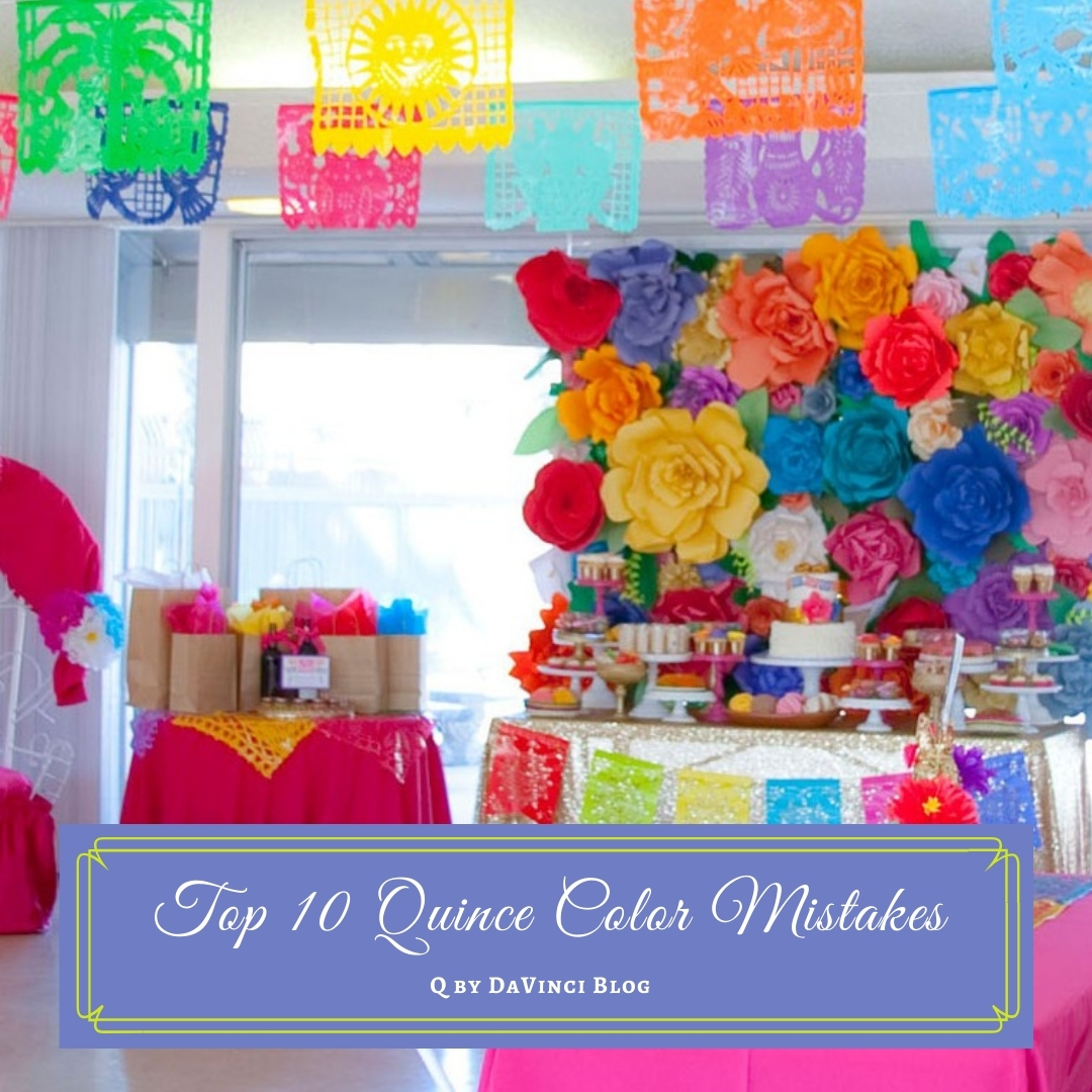
When it comes to your Quinceanera colors, choices can be difficult, but knowing How to Avoid the Top 10 Quince Color Mistakes can really help.
You may not be having any trouble choosing your Quinceanera colors—or you may be struggling to figure out exactly what you want. Either way, there are a few guidelines to follow.
For sure you want your photos to look amazing, and it’s the little things that make all the difference when it comes to color planning. These top 10 mistakes can help you avoid both the major and the minor Quince color scheme blunders so you can have a gorgeous Quince and gorgeous photos!
How to Avoid the Top 10 Quince Color Mistakes
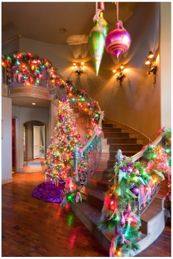
#1: Thinking you Have to Choose Seasonal Colors
Christmas Quinces do not have to be red and green. Winter Quinces don’t need to be ice blue. And spring, summer, and fall don’t need to have just pastels, or just bright “summery” colors, or only “autumn” tones of brown, orange and brick red.
Think outside the box. If you just love a particular color palette but it’s “not in season” go for it anyway! Then customize it a little to make it fit. Forget what color things are “supposed to be” and make them your own—like a turquoise Christmas tree!

Source: Pinterest
If summer sunflower yellow and brown feels awkward in March or November, tone it down to either golden yellow and copper brown, or lighten it up to soft lemon yellow and tan.
For a Christmas Quince, try either a pastel palette or the “new” jewel tone holiday colors of lime green, purple, and hot pink or raspberry.
They’ll look gorgeous especially if you use trees in your decor decorated with traditional red and green plus lime and a pop of purple and pink.
Quince Color Mistake #2: Thinking you Have to Use a Traditional Color Scheme
Dare to be different. Just because you want a traditional Mexican Quince doesn’t mean you need to stick to red, white and green. Throw in a healthy dose of gold as an accent or choose gold metallic dama dresses. You could also go with a rainbow palette like Dia de Los Muertos.
Source: Pinterest
Likewise, a Quince planned on or near the 4th of July will look “ordinary and predictable” if you use standard red, white and blue. To mix it up, deepen the red and change the shade of blue. Go with a rich cranberry red and a blue with a little purple in it like cobalt.
How to Avoid the Top 10 Quince Color Mistakes
#3: Using Too Many Colors without a Neutral
Even if you’re going with a deep dark rainbow palette like a Dia de Los Muertos theme, or the bright primary color stripes of a traditional Mexican Quince, don’t get carried away and use multi-colored everything.
Source: Pinterest
Use the rainbow effects in a few prints as accents in the table linens and maybe your chambelanes’ bow ties and offset with single-color centerpieces. Then set eveything off with either solid white or solid black.
You can also go the opposite and have solid color linens and fabrics while making the rainbow colors pop in the floral arrangements.
Pro tip: Experts recommend that you go with no more than 2 to 4 main colors, then add neutrals, white, and definitely green foliage for a cohesive and professional look.
Quince Color Mistake #4: Not Giving your Vendors a Specific Color Sample
Especially when it comes to flowers and your cake, if you tell your florist and baker your theme is “purple and pink” or “green and peach” without giving them either a photograph, a fabric swatch, or something like a color chip with the exact shade you want for each color, you may be in for an unpleasant surprise when you walk into your venue.
Tip: One of the easiest things to do is to give each vendor a paint color chip with the shade you want.
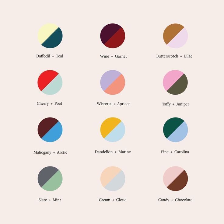
How to Avoid the Top 10 Quince Color Mistakes
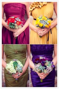
#5: Making Every Shade Match
Source: Sarah Renae Clark
No matter what your color scheme, make sure to vary the intensity and even the hue of your colors, especially if you’re going monochromatic. You don’t want to order the napkins, flowers, invitations, and giveaway bags in the exact same shade.
For instance, if your primary color is blue, mix and match a little by using royal blue, navy blue, cobalt blue, and periwinkle.
Quince Color Mistake #6: Using Only Two Colors
Believe it or not, it’s possible to not use enough different colors for your Quince.
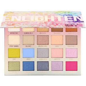 Source: IBY Beauty
Even if you want a monochromatic (one color) color scheme, you don’t want to use just your favorite color plus white. Make it rich my adding 2 or 3 neutrals like ivory or dove gray into the color scheme, then use plenty of greenery in your flowers.
Tip: To make decorations like balloon bouquets or arches pop, add a touch of fresh or silk greens or add zing with metallic ribbons.
How to Avoid the Top 10 Quince Color Mistakes
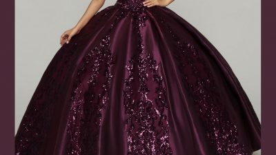
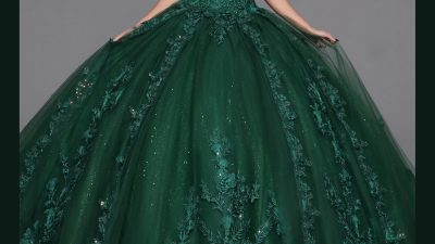
#7: Forgetting to Use Texture
Have you ever seen a wedding—or a Quince—where all the attendants are dressed in just satin? Satin dresses, shoes dyed to match (which gives them a satiny sheen) and satin vests and ties on the guys? It’s all “shiny” right? That’s because there’s a lack of texture to the fabrics.
The easiest way to get a start on texture is with your Quinceanera dress.

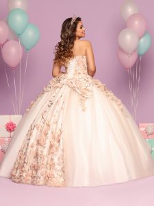
To see more details Click HERE for Q by DaVinci Style 80476
The way to solve that problem with your court is to add texture to the materials. You can mix up the bodices and skirts of your damas’ dresses by using a combination of chiffon, metallic, glitter, velvet, even cotton, in addition to—or instead of—either all shiny or all matte fabrics.
You can also add texture to your color scheme by mixing in stripes, prints, polka dots, florals, stripes, chevron, or floral prints. In this case, it’s not the finish of the fabric that creates “texture” but the pattern that breaks up the “flatness” and creates the texture effect.
Quince Color Mistake #8: Ignoring the Colors of the Venue
The last thing you want is to have a color scheme of orange and brown in a venue with rose pink carpet! There are essentially three ways to solve this problem:
- Choose your venue first then choose your color scheme to complement the venue.
- Choose your color scheme first then find a venue that will work.
- Book a super-neutral venue like a church hall, VFW or Knights of Columbus hall, or a hotel ballroom that’s all completely neutral shades like beige carpet and white or ivory walls—a venue that’s essentially a “blank slate” that you can decorate at your whim.
How to Avoid the Top 10 Quince Color Mistakes
#9: Forcing Your Flowers to Match
Source: Pinterest
If you choose a color theme that uses shades that don’t typically come in natural flowers, don’t dye everything to match. The biggest mistake—and this always looks fake—is to have flowers like carnations dyed blue or purple or some other color that isn’t natural to the bloom.
It also looks fake to have too many silk flowers in non-natural colors. A few are fine for accent, but do your best to use flower colors that grow naturally.
Some blooms do come in unusual colors, but only at certain times of the year. For instance, hydrangeas are available in blue but only in certain seasons. If you can get them at all, you’ll pay a lot extra.
The solution is to use a complementary color or a neutral then add a pop of your theme color in the ribbons or in a vase, etc.
Color Blunder #10: Making your Court Exactly Match your Theme
Here’s another time that borrowing ideas for bridesmaids dresses comes in handy.

Source: Pinterest
You probably already know not to put your court in “costumes” except for the surprise dance, right? Also be careful not to dress them in colors that are too “neon” or “crayon” to look good against the skin. For instance, sunny yellow, orange, hot pink and olive green are gorgeous for table linens and napkins, but they don’t necessarily make for good clothing colors.
To avoid this, you can either tone down the brightness and use pale lemon yellow, peach, soft rose of mauve and sage green for your court, then use a pop of color in the boutonnieres and maybe even your damas’ shoes.
Want to know more about the meaning of Quinceanera dress colors? Click HERE or on the image below to read Your Quinceanera Dress: What the Colors Symbolize

Find everything you need to plan your perfect Quinceanera on our website—our dresses, our blog—everything! Click HERE or on the image below for Q by DaVinci & get started!

Comments